Choosing the right colours for your home is an exciting activity but getting the right colours also matters to spruce up your ‘safe haven’. So, here are some tips to get you going.
Subtle and Soothing
Keywords to remember are ‘light colours’ – such as pastels, be it blue, lavender, pink or yellow. They make great choices in inducing a romantic or tranquil feeling, especially in spaces that are meant for rest and relaxation. To make the room even more interesting, change the textures for accessories and bedding. This can certainly brighten or ‘cheer up’ the overall mood in the room. The colours of your room furniture or accessories can be different than that of the walls. Choose colours from within the same scheme (the same family/ palette/ hues). For example, if you choose teal for walls, get a lighter green for the bedding or accessories such as candles or curtains.
Elegant
Go for neutral colours. This, however, is not restricted to white or beige. Switch your room up by adding a splash of neutral colours by selecting varying shades like almond walls with red toned browns for the trims or even prints. You can either pick lighter or deeper neutral colours for the trims or walls to add to the detail. A lighter colour can make the space appear spacious, while shades of rust, mahogany or garnet can add to its elegance, earthiness and richness.
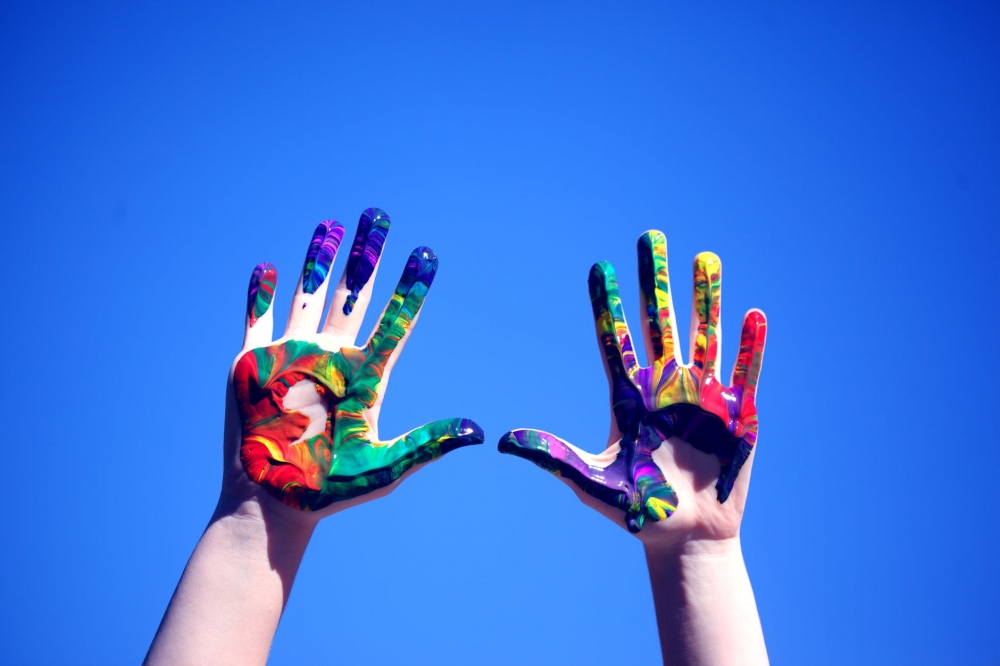
Vibrant
Bold. Go for bright or deep colours for your safe space if it fits your personality. If you’re choosing colours such as orange, gold, red and purple, complement them by picking a colour from the opposite side of the colour wheel—for example, orange or gold on one wall and purple on the other. Meanwhile, you can also create a visual contrast by choosing two colours next to each other on the colour wheel, like blue and green.
Colour theme for 2020
If you’re wondering, here are a few colour themes that are trending this year:
1. Classic Blue
Being the pantone colour of the year, this hue is the go-to colour in homes (especially new ones).
2. White
If you think it’s boring, think again. Try adding layers – white on white. For example, white curtains against white windowpanes set a tranquil mood.
3. Blush
A subtle pink, this colour was termed ‘millennial pink’ around 2016 and has become a chosen colour to be mixed with warmer jewel tones for a chic feel.
4. Burnt Orange
Though this is a ‘pop’ colour, use them in moderation and watch how it lights up your mood.
5. Peacock
One of the chosen moody colour – for a calming yet invigorating effect.
6. Hunter Green
For a timeless, chic space.
If you are designing and picking the right elements for homes or any other built spaces, Interior Architecture can certainly suit your needs. Log on to www.segi.edu.my, or call 03-6145 1777 or WhatsApp 011-1210 6389 or speak to our counsellors to learn more about the course at SEGi University.